
July 2022, 2 Week Sprint, 1 Person Team
Project Overview
The project was designed to create an app that helps users find a more convenient way to go on vacation. It sought to solve travel problems like planning, overspending, and finding hidden locations.
Scope of Work
I interviewed four people to get their thoughts, opinions, and complaints about traveling. After noticing some patterns and considering them, I developed sketches, wireframes, and mid-fidelity prototypes for a new app.
Five people were hired to test the prototype. Upon recording their testing experiences, conducting some follow-up interviews, and making more insights, new plans were made to conduct further research and redesigning.
Problem Space Statement
Vacationers need to find activities that aren’t as well known by expensive travel agents or other tourists so that they may have more meaningful experiences when traveling abroad. How might we help tourists find things to do on vacation that aren’t well known by agencies and brochures? How might we give travelers a “local’s experience?”
Research Phase
I set out to understand the typical vacation experiences; what was great, what wasn’t and what needed to be improved.
Goal of Research
Methodology
I interviewed 4 individuals, asking them a series of questions about their past vacation experiences. I asked about their family situation, what they hate the most about traveling, what could be improved, and what they love the most about traveling, among others.
What I learned was that the interviewees wanted to enjoy a country’s culture, despite not knowing the language, and to know important safety information before they go, such as Covid levels and crime rates.
Another common theme was the idea that cultural events such as festivals should be accessible to people who don’t speak the language, that there needs to be a platform for speakers of all languages to sign up.
One of the biggest frustrations was only being able to find “hidden gem” locations via word of mouth from the locals.
Lastly, there was an overall disillusionment with travel agents and brochures.
Takeaways

Persona
Initially, the persona used was of a single, 29-year-old traveler named Will who’s looking to get out of the house after being overworked for the last three years. This opportunity to travel likely wouldn’t come again and he wanted to capitalize on the opportunity. To make the most of it, he would need an app to create the most immersive vacation experience.
In hindsight, this was not the persona that would benefit the most from this app. Families/parents are much more likely to reap the benefits.
Journey Map

We made a Journey Map to track the thoughts, feelings, and experiences that Will had when he arrived at his new location and went looking for things to do.
Will got off a plane, excited for the vacation to begin. He went to the restaurant the travel agent suggested. There is still excitement, but also apprehension. He didn’t want to be disappointed.
When arriving at the location, Will became frustrated because tourists were everywhere, he had to wait two hours to sit down, and the food was too expensive. He wanted to leave but all the other restaurants in the area were exactly the same way.
Luckily, a local gave Will a recommendation to a more accessible restaurant in the area that’s not catered to tourists. Suddenly there’s hope. He’d be able to eat tonight, and get a local’s experience.

Revised Problem Statement
Insight: Travelers are feeling unfulfilled when they go away but don’t have a resource to improve their trips.
Persona: A mother of three is trying to plan a family vacation with her children and husband. They have been overworked and stuck inside because of Covid. There is an opportunity to travel and they don’t know if the chance will come again. They want to plan their trip out as precisely as possible to maximize their experience.
Problem: Finding things to do on vacation that isn’t a tourist trap. Finding activities that only locals know about.
Goal: To create an app that allows vacationers to discover activities/events that aren’t as well known to travelers.
Insight 1: Travelers can only find local experiences via word of mouth or by traveling with other locals > Function 1: The ability for vacationers to list and discover activities/events in the area that aren’t as well known. The ability for tourists and vacationers to list activities/events for others to discover.
Insight 2: People want to sign up for events in another language without any misunderstandings, misschedulings, or misinformation. > Function 2: Anyone around the world can sign up for an event via the app and pay as well.
Insight 3: What most deterred people from traveling is safety. > Function 3: Leave icons on each listing that tells the user different safety variables like Covid levels, states of unrest, and crime. An added benefit is that it helps break stigmas against prosperous third world nations constantly and incorrectly deemed “dangerous”, which increases visitors to said countries.
Research>Design Synthesis
Design Phase
“Local’s” most basic functions were listing and discovering the activities and events, signing up and paying for them, and icons for the safety variables.
MVP Reveal

The initial sketches were messy and difficult to read, but were eventually upgraded to a neater-looking version that listed eleven pages and numerous features designed to give the optimal vacation experience. Some ideas that were introduced were the basic listing functions, sign ups, filters, a translation function, and the icons.
Findings/Themes/Insights/Takeaways: The simplicity of an app is more valuable than the number of functions it has.
Design Studio: Sketching and Connecting


Initial User Testing: First Round

5 people were chosen for the test. Initially I asked basic questions about family background, such as members of immediate family and experiences on family vacations.
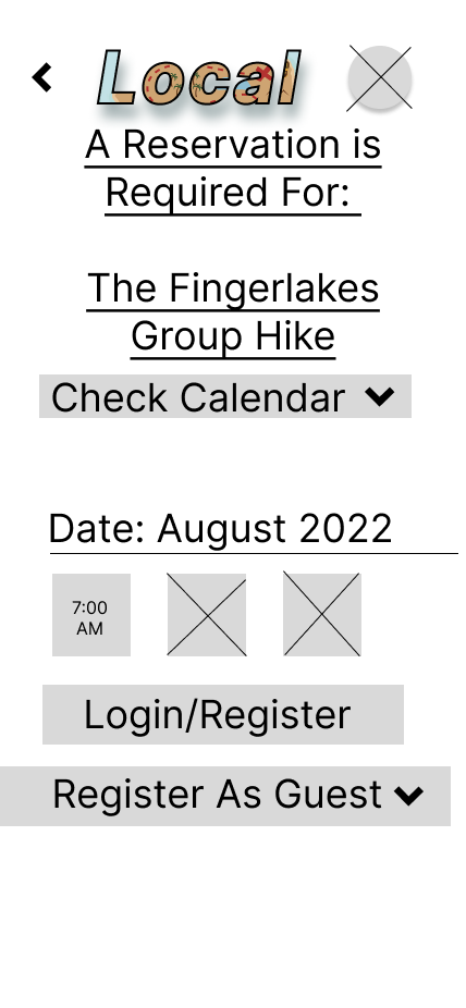
During the test itself each participant was given two tasks: sign up for an activity/event in under 3 minutes, and sign up for an account in under 2 minutes.
3 out of 5 could accomplish the first task, while all 5 could accomplish the second.
After the test, there were a few general qualitative questions such as their overall opinions on the app, as well as questions with a point value on a scale of 1 to 5. The highest point value represented the most positive experience, the lowest represented the worst possible experience. Overall reception of the app was mixed to positive.
Findings/Themes/Insights/Takeaways:
The app is functional but not simple enough. Sign-ins/Sign Ups should be the very first function to save on time and energy of both the user and the designer.
A link to the account page can still be left in the top right corner of the app, but needs to have greater communication as to what it is. A simple “profile” icon would have sufficed.
Better communication regarding what the “Add a listing” function meant is also in need of improvement. Some users misunderstood the function and believed that that would be the location for the actual list of events.
In the future, color needs to be taken away to avoid confusion during mid-fidelity testing. If possible, testing might be more constructive during a hi-fidelity phase because the lack of color in some sections confused the participants.
On a side-note, debriefing questions needed to be reworded after the first two interviewees found them unclear and confusing.
There were no further rounds of User Testing
High-fidelity screens were not created.
Final Prototype
The interface needs to be simplified. Sign in/sign up should appear in the beginning of the app (with an option to skip this step).
Country and State/Province filters should be on the same page as the other filters on the main “Discover” page.
A functional hi-fidelity prototype needs to be implemented followed by further usability testing.
Recommendations/Implementations/Next Steps